Digital Art and Renderings
Ace Attire.
Ace Attire is a tennis wear and product store located in Soho, NY that is taking on a story of the power and elegance of tennis. Ace Attire translates that story through the use of curves found within the fixtures and furniture, LED lighting, intriguing columns, and by highlighting familiar shapes. This store is an experience that allows the user to fully wrap themselves in the history and lifestyle of tennis. Tennis wear is not just for the court but also for your everyday active lifestyle. Throughout the store you’ll find some hidden gems, such as vintage ash wood tennis rackets, posters and photographs of tennis players that shaped the game, and the apparel worn by well-known players.
Coach - Swing into Style: Reimaging Baseball and Fashion
"Swing into Style" is a sensory pop-up that reimagines how one would experience baseball and fashion. Coach was founded in 1941 by a group of leather artisans and seventeen years later a glove-tanned cowhide bag, inspired by a baseball mitt was launched. The bag was designed for a new type of woman, it is durable yet flexible.
The pop-up immerses the client into the Coach brand taking you back to 1960s New York, following the layout of a baseball field to tell a story that may be unknown.
The senses explored are smell and touch. Smell is done through a tunnel of fragrance, leading you to the new shopping experience with curved fixtures, refurbished leather, and new technologies.

Michael Kors Carousel Concept Store
The “Jet Set” concept is to feel elegant and luxurious no matter what you’re doing. Running around doing errands, hopping on a plane, even sitting down watching a classic movie. It is built for you, to move with you…even on a carousel. The design from the shop windows to the interior, is a space that is modern, glamorous, and has movement. Materiality would help emphasize the glamour by using marble, gold, aluminum and touches of black.

Denmark Official Residence
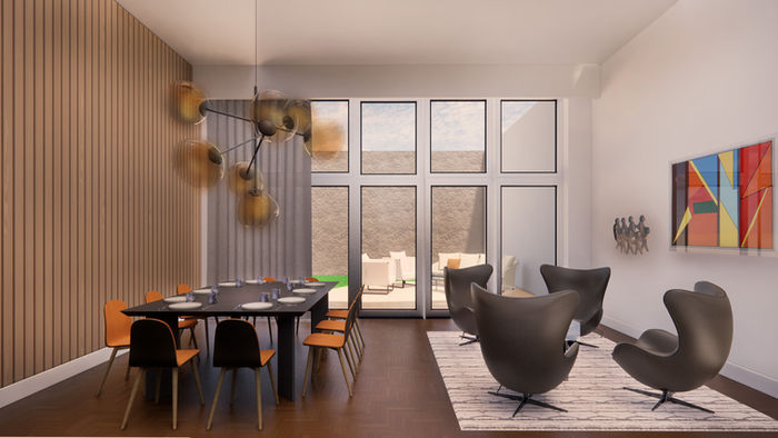
The official residence of the consul of Denmark is inspired by the artworks selected by the client. The design aims to represent Denmark’s values and progressive nature in a bold, modern, and angular way. Angles are used throughout the design to increase daylight and create bold transitions between spaces.
Avandra - A Greek Experiential Restaurant
Part of the experience of Greece is the trip there. Along the way you are surrounded by the Aegean Sea and thousands of islands just waiting to be discovered. The arrival is slow but exhilarating. There is a rush of anticipation to get off the ferry and step on the island. The view is full of architecture and life. The architecture is not perfect. It has texture and rich history. Everywhere you turn the view changes. As the day starts to fade away, the island is illuminated in every direction. There is light where there wasn’t before. Now it’s a whole new experience. Avandra is a mysterious and adventurous dining experience inspired by the islands, serving Greek cuisine. The design is enhanced by natural materials and colors found in Greece, such as marble, wood, concrete, stone, and shades of blue and gray. Investing in the restaurant is David Bowie, due to his adoration for the islands Cyprus and Patmos after visiting with his family.
Corita Kent - Memorial & Exhibit
Corita Kent was an artist, educator, and advocate for social justice. She entered a religious order at the age of 18 where she later became an art teacher. Kent was one of many Pop Artists during the 1960s. With her art, she not only expressed her adoration for art, but also used it to show biblical verses, as well as her political views on the situations at the time. About 30 years later she left the religious order, in which she battled with cancer and continued to find new perspectives and topics for her art. Spirituality is being able to find deep inside oneself the peace and tranquility that leads to free and expressive creativity. This memorial is also an art exhibit that explores Corita’s life, and how she found her peace and light that paved the way to hundreds of works of art filled with color, passion, and history. By using natural materials in earth tones and letting in natural sunlight, it creates a calm and peaceful environment.
Papertile - Showroom
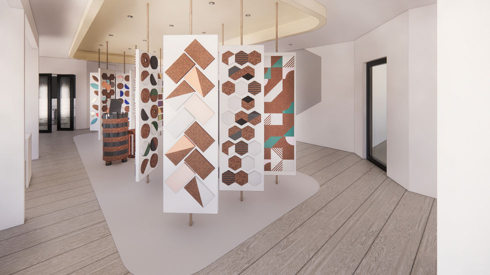
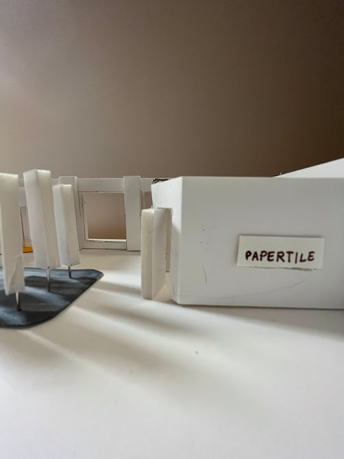
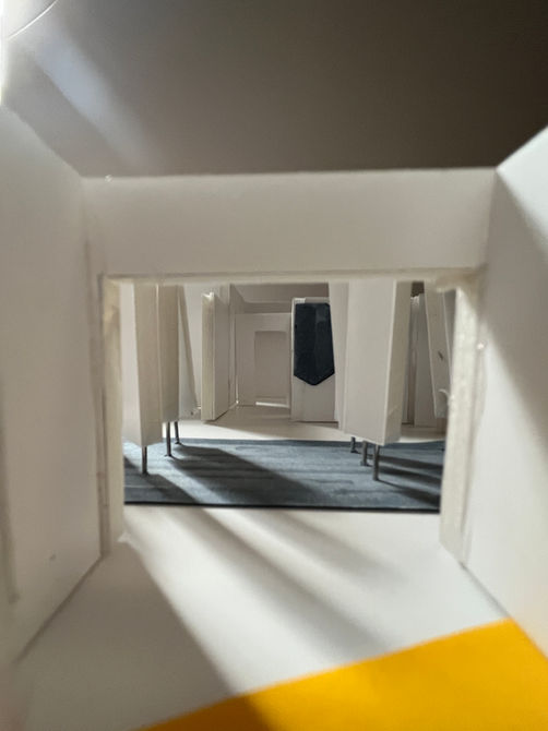
Papertile, values the use of waste to create a new product, which has influenced the design for their showroom to use sustainable materials and encourage recycling. The use of sustainable products is very important especially for interior designers and architects. Products are constantly changing and in turn are disposed of incorrectly. Due to the repetition of colors and shapes, the showroom becomes a playful environment that reflects the products’ possibility to be custom-made. The use of semi-pivate work spaces creates an open environment for collaboration with others. The entire showroom not only displays Papertile, but it also shows how a space looks with the product used, as well as the variety of color and pattern combinations that can be made.
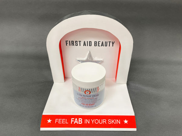
First Aid Beauty - 3D Point of Purchase Display
First Aid Beauty (aka FAB) is a cruelty free skincare brand that uses clean ingredients. Their target client are teens and young adults with sensitive skin. FAB is sold at Sephora, Ulta Beauty, Target, and their online website.
The P.O.P. Display will use materials that are durable enough for temporary use. For a long-lasting display, the cardboard or foam core would be swapped for plywood or an opaque acrylic.


